First Steps with QML
Creating a QML Document
A QML document defines a hierarchy of objects with a highly-readable, structured layout. Every QML document consists of two parts: an imports section and an object declaration section. The types and functionality most common to user interfaces are provided in the QtQuick import.
Importing and Using the QtQuick Module
To use the Qt Quick module, a QML document needs to import it. The import syntax looks like this:
import QtQuick 2.3
The types and functionality that Qt Quick provides can now be used in the QML document!
Defining an Object Hierarchy
The object declaration in a QML document defines what will be displayed in the visual scene. Qt Quick provides the basic building blocks for all user interfaces, such as the objects for displaying images and text and for handling user input.
A simple object declaration might be a colored rectangle with some text centered in it:
 Rectangle {
     width: 200
     height: 100
     color: "red"

     Text {
         anchors.centerIn: parent
         text: "Hello, World!"
     }
 }
This defines an object hierarchy with a root Rectangle object which has a child Text object. The parent of the Text object is automatically set to the Rectangle, and similarly, the Text object is added to the children property of the Rectangle object, by QML.
Putting it All Together
The Rectangle and Text types used in the above example are both provided by the QtQuick import. Putting the import and object declaration together, we get a complete QML document:
 import QtQuick 2.3

 Rectangle {
     width: 200
     height: 100
     color: "red"

     Text {
         anchors.centerIn: parent
         text: "Hello, World!"
     }
 }
If we save that document as "HelloWorld.qml", we can load and display it.
Creating and Running QML Projects
To display the graphical scene defined by the QML document, it may be loaded with Qt Creator. For simple UI files such as this one, select File > New File or Project > Applications > Qt Quick UI from within Qt Creator.
Pressing the green Run button runs the application. You should see the text Hello, World! in the center of a red rectangle.
For more information about creating and running projects in Qt Creator, visit the following pages:
Creating QML Applications with Controls
While Qt Quick provides basic graphical elements, Qt Quick Controls provides ready-made QML types for use within an application.
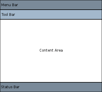
Inserting the ApplicationWindow type is a good starting point for creating applications. An application UI has this basic layout:

Within each area, different controls may be added and connected to form an application. For example, the following snippet is a basic application that demonstrates the use of available space:
 //import related modules
 import QtQuick 2.12
 import QtQuick.Controls 2.12

 //window containing the application
 ApplicationWindow {

     //title of the application
     title: qsTr("Hello World")
     width: 640
     height: 480

     //menu containing two menu items
     menuBar: MenuBar {
         Menu {
             title: qsTr("File")
             MenuItem {
                 text: qsTr("&Open")
                 onTriggered: console.log("Open action triggered");
             }
             MenuItem {
                 text: qsTr("Exit")
                 onTriggered: Qt.quit();
             }
         }
     }

     //Content Area

     //a button in the middle of the content area
     Button {
         text: qsTr("Hello World")
         anchors.horizontalCenter: parent.horizontalCenter
         anchors.verticalCenter: parent.verticalCenter
     }
 }
The application has two menu items and a button in the middle. Clicking on the Exit menu item closes the application.
There are also different navigation methods and different controls such as buttons and sliders. The following examples are available from Qt Creator and demonstrate different controls and layouts.
Feel free to copy and paste the snippets onto this simple Hellow World application to see how QML works.
Handling User Input
One of the great advantages of using QML to define a user interface is that it allows the user interface designer to define how the application should react to events with simple JavaScript expressions. In QML, we refer to those events as signals and these signals are handled by signal handlers.
For example, consider the following example:
 import QtQuick 2.12

 Rectangle {
     width: 200
     height: 100
     color: "red"

     Text {
         anchors.centerIn: parent
         text: "Hello, World!"
     }

     TapHandler {
         onTapped: parent.color = "blue"
     }
 }
This example can be saved as "ClickableHelloWorld.qml" and run with qmlscene. Whenever the user clicks anywhere in the window, the rectangle will change from red to blue.
Note: TapHandler also emits the tapped signal for touch events, so this code will also work on a mobile device.
Keyboard user input can be similarly handled with a simple expression:
 Rectangle {
     width: 200
     height: 100
     color: "red"

     Text {
         anchors.centerIn: parent
         text: "Hello, World!"
     }

     focus: true
     Keys.onPressed: {
         if (event.key == Qt.Key_Return) {
             color = "blue";
             event.accepted = true;
         }
     }
 }
By accepting focus, the color can be changed to blue whenever the return key is pressed.
Property Bindings
Objects and their properties form the basis of a graphical interface defined in a QML document. The QML language allows properties to be bound to each other in various ways, enabling highly dynamic user interfaces.
In the following example, the geometry of each child Rectangle is bound to that of the parent Rectangle. If the geometry of the parent Rectangle were to change, the geometry of each child Rectangle would automatically update due to the property bindings.
 Rectangle {
     width: 400
     height: 200

     Rectangle {
         width: parent.width / 2
         height: parent.height
     }

     Rectangle {
         width: parent.width / 2
         height: parent.height
         x: parent.width / 2
     }
 }
Animations
Properties can also be dynamically updated via animations. The QtQuick import provides various animation types which can be used to animate changes to a property's value. In the following example, a property is animated which then gets displayed in a Text area:
 Rectangle {
     color: "lightgray"
     width: 200
     height: 200

     property int animatedValue: 0
     SequentialAnimation on animatedValue {
         loops: Animation.Infinite
         PropertyAnimation { to: 150; duration: 1000 }
         PropertyAnimation { to: 0; duration: 1000 }
     }

     Text {
         anchors.centerIn: parent
         text: parent.animatedValue
     }
 }
The value being displayed will vary from 0 to 150 periodically.
Defining Custom QML Types for Re-use
One of the most important concepts in QML is that of type re-use. An application will probably have multiple visual types which are all similar (for example, multiple push buttons), and QML allows these sort of things to be defined as re-usable, custom types, to minimize code duplication and maximize readability.
For example, imagine that the developer defines a new MessageLabel type in the MessageLabel.qml file:
 // MessageLabel.qml
 import QtQuick 2.12

 Rectangle {
     height: 50
     property string message: "debug message"
     property var msgType: ["debug", "warning" , "critical"]
     color: "black"

     Column {
         anchors.fill: parent
         padding: 5.0
         spacing: 2
         Text {
             text: msgType.toString().toUpperCase() + ":"
             font.bold: msgType == "critical"
             font.family: "Terminal Regular"
             color: msgType === "warning" || msgType === "critical" ? "red" : "yellow"
             ColorAnimation on color {
                 running: msgType == "critical"
                 from: "red"
                 to: "black"
                 duration: 1000
                 loops: msgType == "critical" ? Animation.Infinite : 1
             }
         }
         Text {
             text: message
             color: msgType === "warning" || msgType === "critical" ? "red" : "yellow"
             font.family: "Terminal Regular"
         }
     }

 }
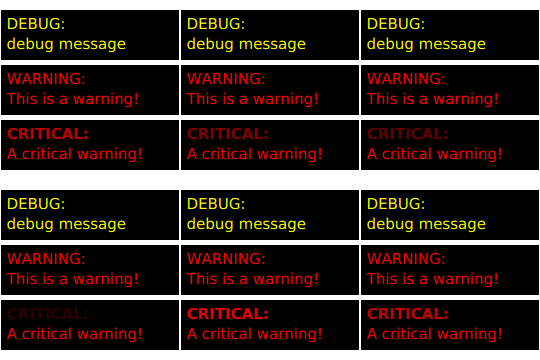
That type may now be re-used multiple times in the application, as follows:
// application.qml import QtQuick 2.12 Column { width: 180 height: 180 padding: 1.5 topPadding: 10.0 bottomPadding: 10.0 spacing: 5 MessageLabel{ width: parent.width - 2 msgType: "debug" } MessageLabel { width: parent.width - 2 message: "This is a warning!" msgType: "warning" } MessageLabel { width: parent.width - 2 message: "A critical warning!" msgType: "critical" } } |
|
In this way, modular user interface types are assembled and reused within an application.
See QML Object Attributes for more details on how to develop your own reusable components.
Where to Go from Here
Now that you have seen QML in action, you are ready to take your next step. The follow page will lead you in your journey with QML.
